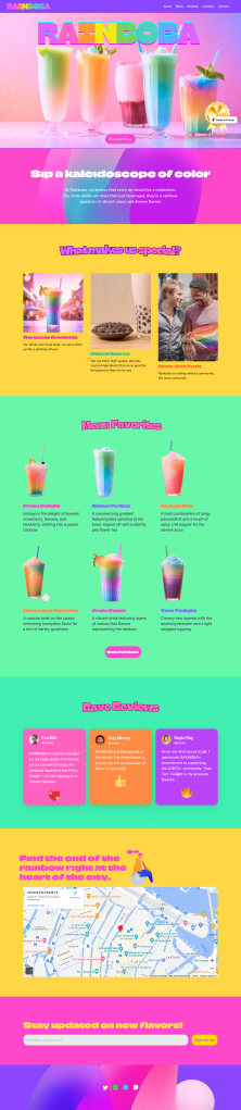
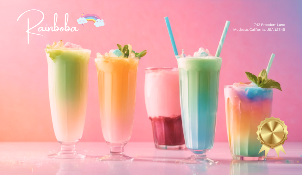
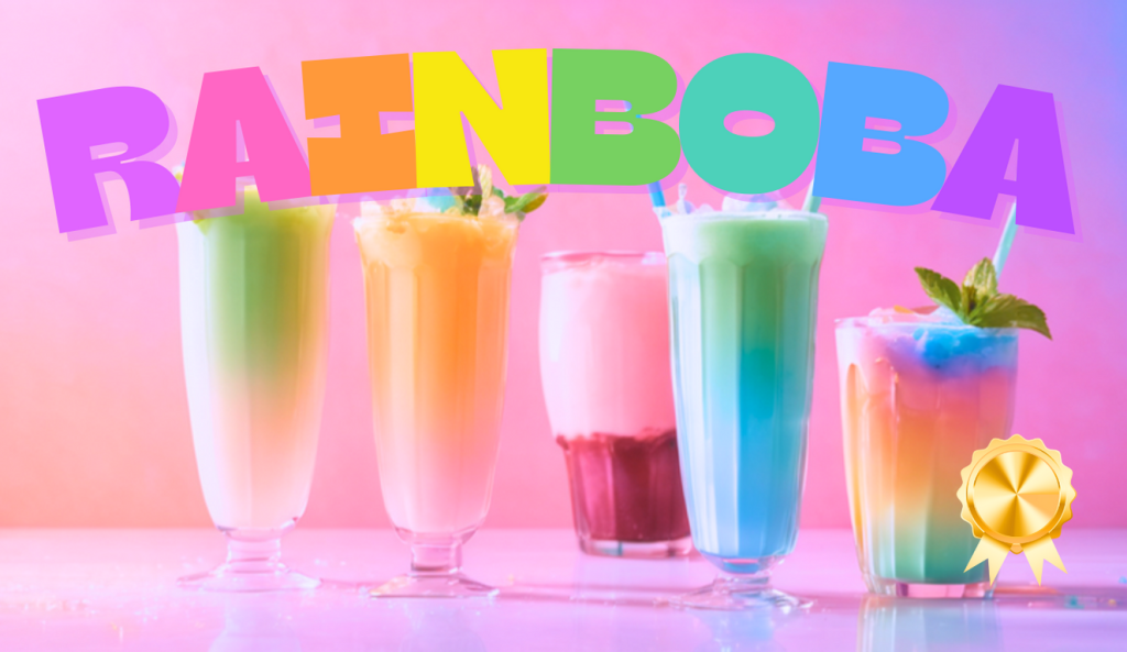
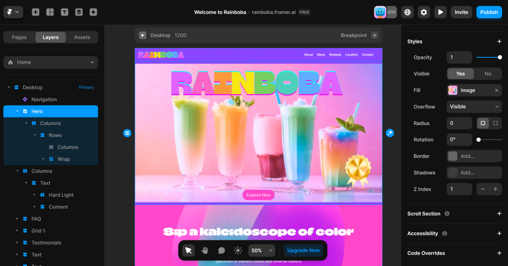
For Out In Tech Mentorship, I created a visual design and prototype for a rainbow-themed drink cafe website.
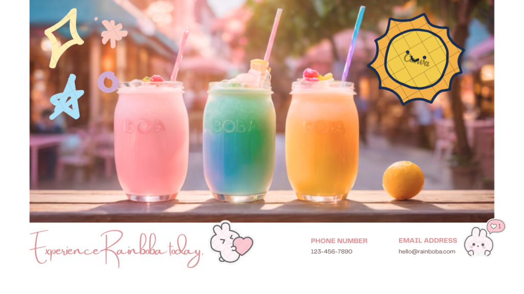
See the finished prototype at the bottom or at https://rainboba.framer.ai/.
Case Study:
With the guidance of my mentor Mackenzie Wyatt, I created a document for learning goals and set guidelines for a project feasible in 8 weeks, considering minimum viable product and stretch goals.
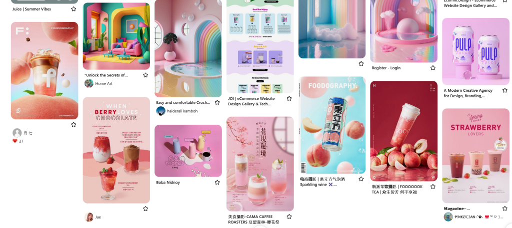
I thought a landing page for a boba restaurant menu would be thrilling to tackle, so I researched competitors to:
- study their branding
- reference their call to actions
- gather website sections and sense of general layout
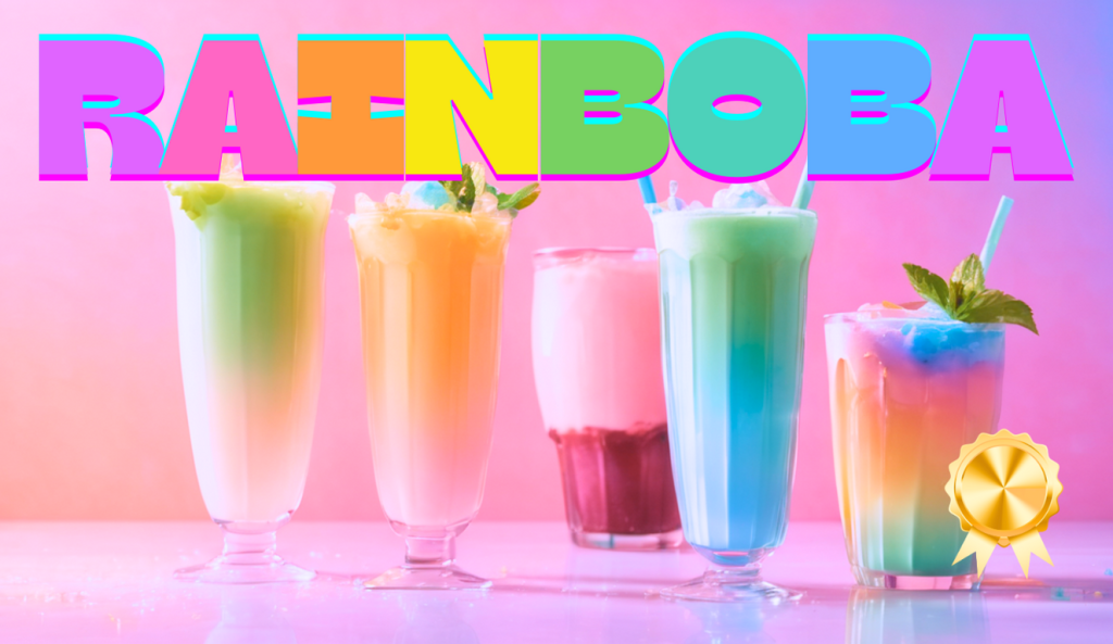
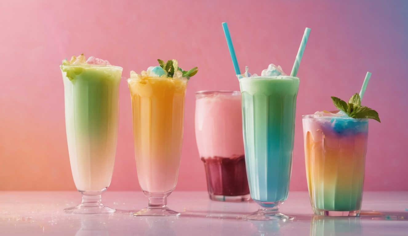
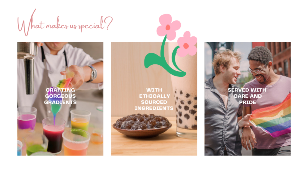
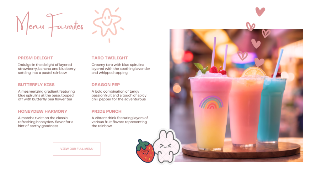
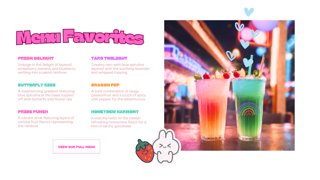
During this project, I utilized AI to speed up parts of the process and spark creativity. I prompted ChatGPT to generate imagery and copy for a rainbow-themed boba cafe. Taglines. Reviews. Menu items. But then of course, I had to edit and tailor the copy to my specific project. I combined and narrowed down drink ideas to blend with theme of gradient drinks forming a rainbow. I was also psyched to learn that gradients in drinks can be made from layering differently weighted colored liquids, such as with blue spirulina with cream, and light butterfly pea tea in green on top.
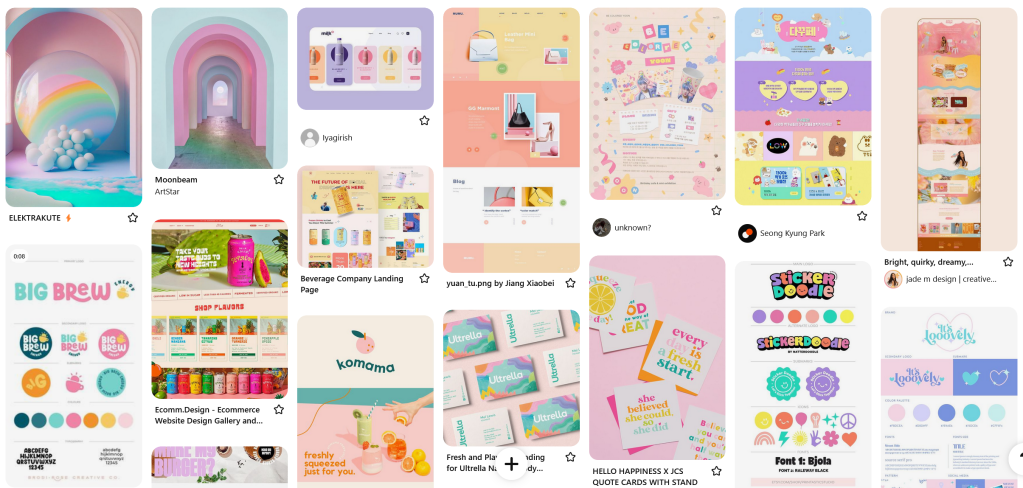
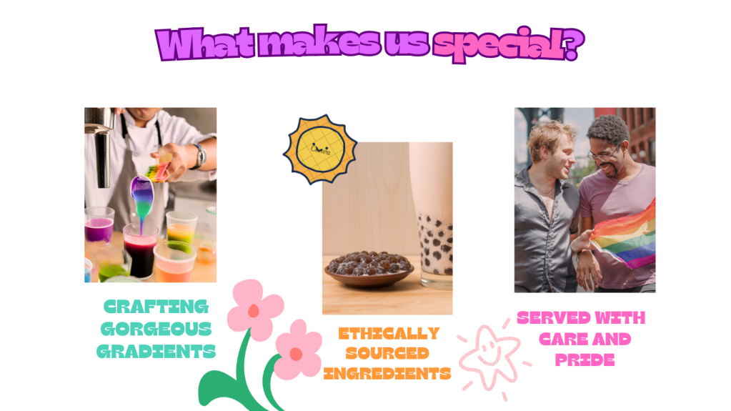
With the branding in place, I put together a Pinterest board to explore the visual aesthetic. I discovered stickers are a fun element to inject personality into the page. I was drawn to pastel and rainbow color schemes, with titles in bold fonts and fruity colors. Additionally, crisp and clean photography.
After this research and exploration, I hopped into Procreate to create low-fi wire frames to get a sense of layout, without being distracted by aesthetics. I made two versions with slight variations and different calls to action.
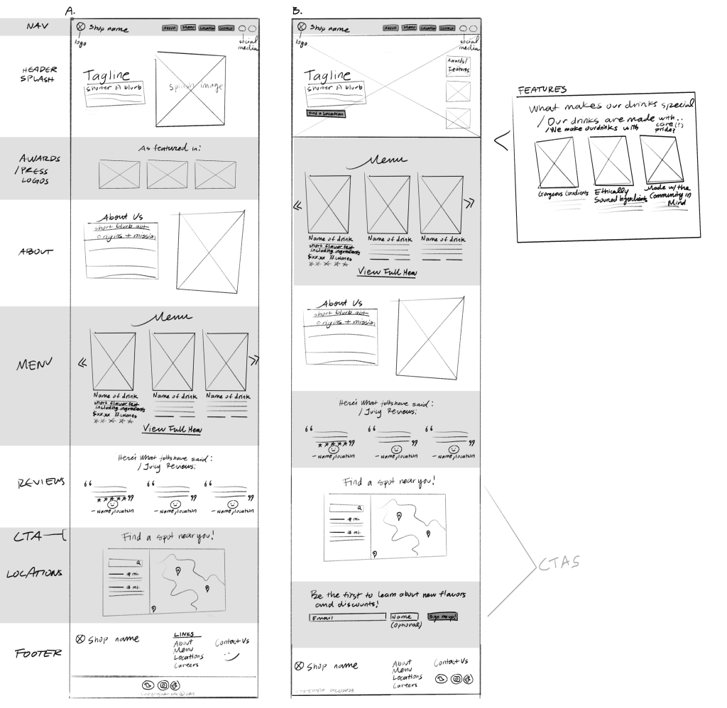
With my mentor, I asked for and received feedback at every stage, which was really useful. Mackenzie emphasized the importance of a good call-to-action at the bottom of the page. We figured the second wire frame with both Find A Spot and Sign me up would double the call to action, if they’re still on the page at the end.
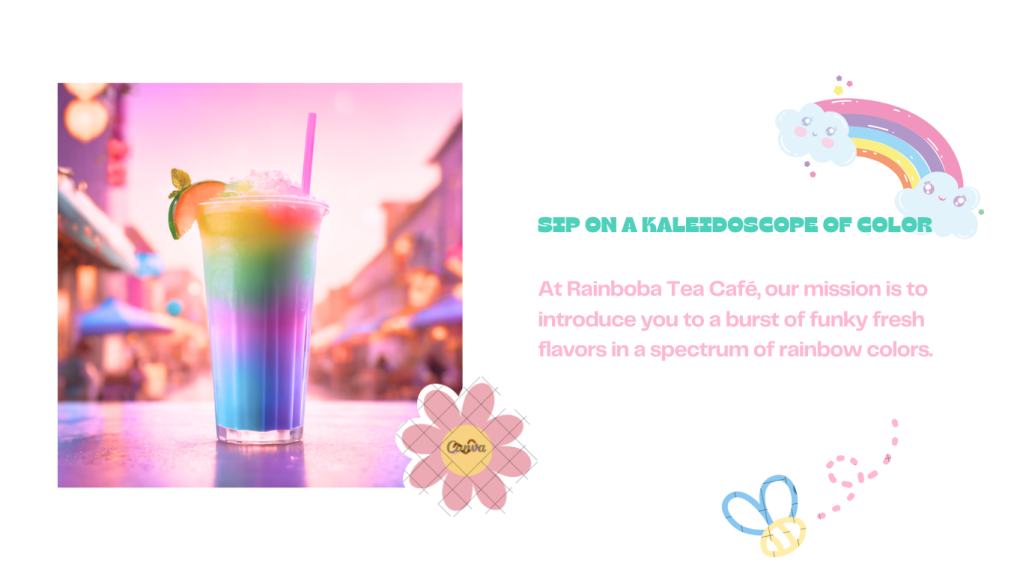
I enjoyed making hi-fi wire frames in Canva, experimenting with font styles, color contrasts, and palettes. The two directions I explored were informed by my moodboard: Version A featured softer contrast, a rosy palette, muted contrast when editing photos, and an elegant handwritten font. This conveyed a classy, sophisticated experience. Version B was bolder with a funky retro font and a palette reminiscent of fruit salad, bringing a more casual and fun tone.
By combining the low contrast pink tones with the bold font choice, I was able to blend the once-conflicting dreamy pastel and bright fruity colors into an aesthetic well-suited for a fresh and unique drink brand.
Before and after editing imagery to fit the tone of the brand:
VERSION A:
VERSION B:
We both liked Version B a lot. So, I brought it into the website builder Framer. I exported assets from Canva and removed the backgrounds where necessary. It was a bit tricky to figure out padding with some elements and between different device screens.
What I would do to improve:
- I would bring it into Figma. Had a few obstacles to access – my laptop broke down and unfortunately Figma only allows viewing and not editing on iPad. So I hopped into Canva, which I was more familiar with. For the limited time we had, it was perfect for iterating on aesthetics, while also giving me ideas for layouts.
- I would actually photoshop boba balls onto the drinks. 😂
See the finished prototype below or at https://rainboba.framer.ai/.